 |
|
You can also set up a toolbar on the main window to improve the user interface and provide one-click accessibility.
To do this, create a toolbar named MainToolbar in the Start class and below this toolbar you can add individual toolbar entries as shown in the following image.
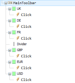
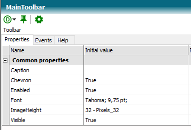
A toolbar contains an important property, namely the ImageHeight property. The images of the individual toolbar entries are scaled to the set image height. The image width for all toolbar entries is determined by the scaled image width of the first image of the toolbar.
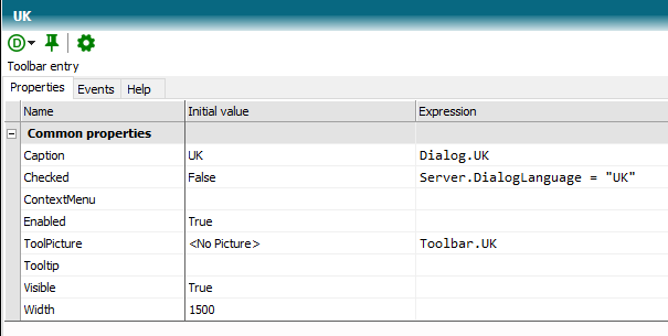
Toolbar entries have an image (ToolPicture) and a text (Caption). The Enabled and Checked properties can be used to change the state of a toolbar entry. The Tooltip is text that appears when the mouse pointer lingers over the toolbar entry.
The images and texts are recorded in image constants in this tutorial:
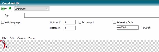
Please pay attention to free backgrounds for optimal output. In the image editor of TCE you will find a function to remove a specific background color if the image is not already available as a transparent PNG.
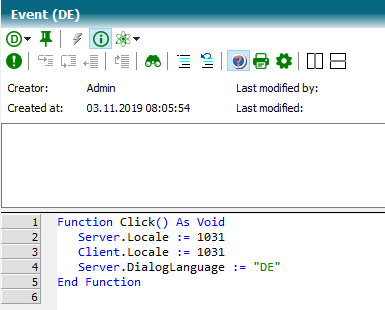
Use the Click event to respond to the user action.
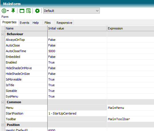
The MainToolbar toolbar is now linked to the main window form:
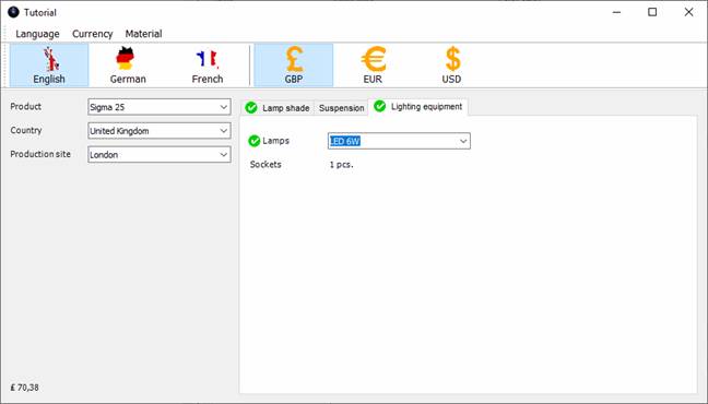
Once you've implemented all the toolbar entries, your application might look something like this:
(knowledge base Tutorial Stage 11)
 Contents
 Index
Index Previous
 Next
Next